
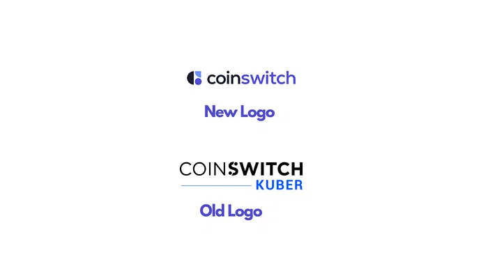
CoinSwitch, the Crypto investing app, has revealed an all-new brand identity, which includes a new logo, colours, font, and a refreshed mobile app. The company is on its way to becoming the first Indian crypto company to diversify into other asset classes as part of its mission to make money equal for all.
The brand-new app encapsulates multiple asset classes with a simple intuitive design by bringing a unified view across multiple asset classes. The refreshed mobile app takes a content-first approach through bite-sized information, aided by visuals, enabling users to make data-backed investment decisions.

The new logo is built on the idea of choices and a diverse portfolio — each portfolio is a composition of different dreams, plans, financial goals, and aspirations. The different shapes in varying sizes and colors convey these values and showcase how every user’s financial journey is different but CoinSwitch accommodates them all.
“At CoinSwitch, we want to revolutionise the financial investment journey for Indians. As we transition from a single-asset app to a wealth-tech destination, we understand now more than ever, the need for a stronger relatable visual personality. We revolutionized crypto investing experience with a simple UI/UX to become the largest crypto investing platform in India. The brand new colourful, contemporary but sophisticated colour palette resembles our core motto — simplicity and inclusion and embodies our vision and the way forward — to become a preferred investment destination for all Indians,” said Ashish Singhal, Co-founder and CEO, CoinSwitch.
“Many Indians are yet to start investing in any asset class. There is a dearth of reliable information from dependable sources. As part of our vision to be a one-stop destination for all investment needs, we have conceptualised this unique inclusive design to attract the new, bold, independent people who want to be wise in making their investment decisions. We want to tell people not just to consume and spend money but to invest money and grow their money. Our new brand identity has taken an approach of no-jargon, bite-sized info, and interesting visuals to aid text. We have also added quizzes and polls where users can apply their learning,” said Swati Pincha, Senior Director – Growth, CoinSwitch.
CoinSwitch’s design overhaul flaunts a range of user-friendly sections including a ‘portfolio’ section that gives a clear view of how the user’s investments are performing, a ‘market’ section that helps users keep a close eye on the price movements, and a dedicated ‘learn’ section with bite-sized content that helps investors stay up to date with everything that’s happening in the market in a simple and quick way.
The new design has adopted a soothing mix of colours — the blueish purple, complemented by darker and lighter blue tones juxtaposed with a bold, zesty lime — that articulates the brand’s personality and enhances the visual appeal of the product. The secondary range of warm but bright colours will assist the primary palette. The dash of pink muted lush of light green, and aesthetically bleached shades of blues and purple will bring our illustrations and other product creatives to life. The brand-new sleeker-looking font, Nexa gives the brand’s visual identity a major lift through its minimal characteristic.